
(6-24-15)
In the book, "Frank Lloyd Wright: His Living Voice", with commentary by Bruce Brooks Pfeiffer, there is a design problem included that Mr. Wright tackled himself and gave to his Fellowship students regarding "Constructing the One Room House". Mr. Wright says that basically a house is essentially one room anyway, with small sleeping quarters. He said he was striving to achieve this sense of unity and spaciousness in "one room" in his own work. He set the requirement at a 36'x36' house and wanted to turn out a one room house for $5,000 (this was in 1954).
I've been intrigued and inspired by this design problem - and due to the current, popular design idea of the "open plan" (invented by Mr. Wright by the way) being expended upon by way of Kitchen/Dining/Living now being one, we are almost there. My other favorite architect, Mies Van der Rohe, also explored this design concept vigorously in what he called "Universal Space" (see his work below).

Above: 50x50 House Project, Mies Van Der Rohe, Architect
Above: Berlin Building Exposition House, Mies Van Der Rohe, Architect
Above: Farnsworth House in Plano, IL., Mies Van Der Rohe, ArchitectThe beauty of this open plan, universal space design concept, is that it provides flexible, free-flowing space for an ever-changing world and time. The trick is, and even Frank Lloyd Wright admitted it could get complicated with a big family, is how to provide Bed "Room" decency and privacy. Below is my humble attempt at the one room house design problem (Note: I did not stick to the 36'x36' parameter - I didn't know about those dimensions until after I had designed this plan).
The basic design ideas/goals (and most are for cost savings) are listed below:
A. Eliminate as many walls as possible while maintaining structural integrity.
B. Porte-Cochere or carport instead of garage.
C. Exposed concrete floor slab as the finished floor.
D. Flowing indoor/outdoor relationship to expand space.
E. Fixed plumbing "rooms" as features in space to delineate different functions.
F. Kitchen is always the center, heart of the home for visibility & connection to all. (Note: Kitchen island seating is rotated 90 degrees for better views instead of backs facing view).
G. Furniture and landscaping would be integral to overall design.
I'm not sure if I passed or failed, but my hope is to have participated in new design thinking and contributed to the discussion

Inspiration for a Commercial Tenant Improvement Project


Cost-Saving Design Tips for Your New Home or Remodel
The economy from 2007 to now (2011) and probably beyond has caused/will cause us all to more thoroughly analyze our expenses and what we're getting for them. Especially hard-hit has obviously been the residential market. The combination of sub-prime mortgages and unrealistic lending practices, along with the McMansion craze and HUGELY over-inflated values could lead to nothing else but a meltdown. The good that might be coming out of this is that people are appreciating that life is not about how big and how much $$, but rather what is the overall quality for the buck. In other words, a lot of us are going "back to basics".
In terms of designing and building your new house or remodeling your existing, "back to basics" can actually be a prudent and exciting design strategy. The size of the average home is actually decreasing by 10-20%. This is a positive trend in my opinion because it becomes more affordable, more livable and easier to maintain for clients, and easier on the environment. Clients want more involvement in the reasoning and logic behind design decisions and how the associated costs enhance the quality of their lives. They, along with their architect, can then make informed decisions in relation to their budget.
That being said, and after much research, experience, and just plain thinking, I've come up with many design tips (up to about 60 now!) to help you manage your home design/construction budget. Here are 10 of those tips:
1. Size: Focus on what you absolutely need 1st, then, if budget allows, go to those "wouldn't that be cool" extras. Remember, everybody talks in terms of cost/square foot, so less square feet can help control cost.
2. Materials: 20' ceilings add a lot of extra material cost as well as associated labor.
3. Shape: I've seen SO MANY new home plans with 48 corners, angles, curves, turrets, etc. A complicated floor plan means a complicated, more expensive facade and roof. Simplify.
4. Plumbing: Group/combine/stack plumbing to save on piping lengths.
5. Lot: Flat lots are typically less expensive to build on than sloping or "rocky" lots.
6. Cabinetry: Cabinets are usually expensive items, so be careful to use wisely. IKEA may be a good option, too. Cherry or Mahogany built-ins everywhere are going to be costly.
7. A/C-Heat: Passive solar design can help reduce the amount of heating and A/C you might need. Orient the house taking advantage of breezes, shade and block cold winter winds.
8. Lighting: Built-in, specialty lighting can get expensive, especially if they are from overseas. Use table/floor lamps with bulbs that you can get anywhere. Again, orient the home & use windows to take advantage of natural light.
9. Landscaping: Maybe plant younger, smaller trees/shrubs, use xeriscaping & reduce irrigation needed. Maybe use pavers instead of concrete.
10. Walls/Doors: Try to reduce the number of walls/doors that compartmentalize the space. Open it up! Define space/needs instead of confining them.
I hope this helps. I'm always interested in designing appropriately-sized, high quality custom houses that don't break the bank. Please feel free to contact me at http://www.colinslais.com/ for your new home. I have 50 more ways to save cost and help you realize your dream!
Beyond the Box - Time for a New Architecture
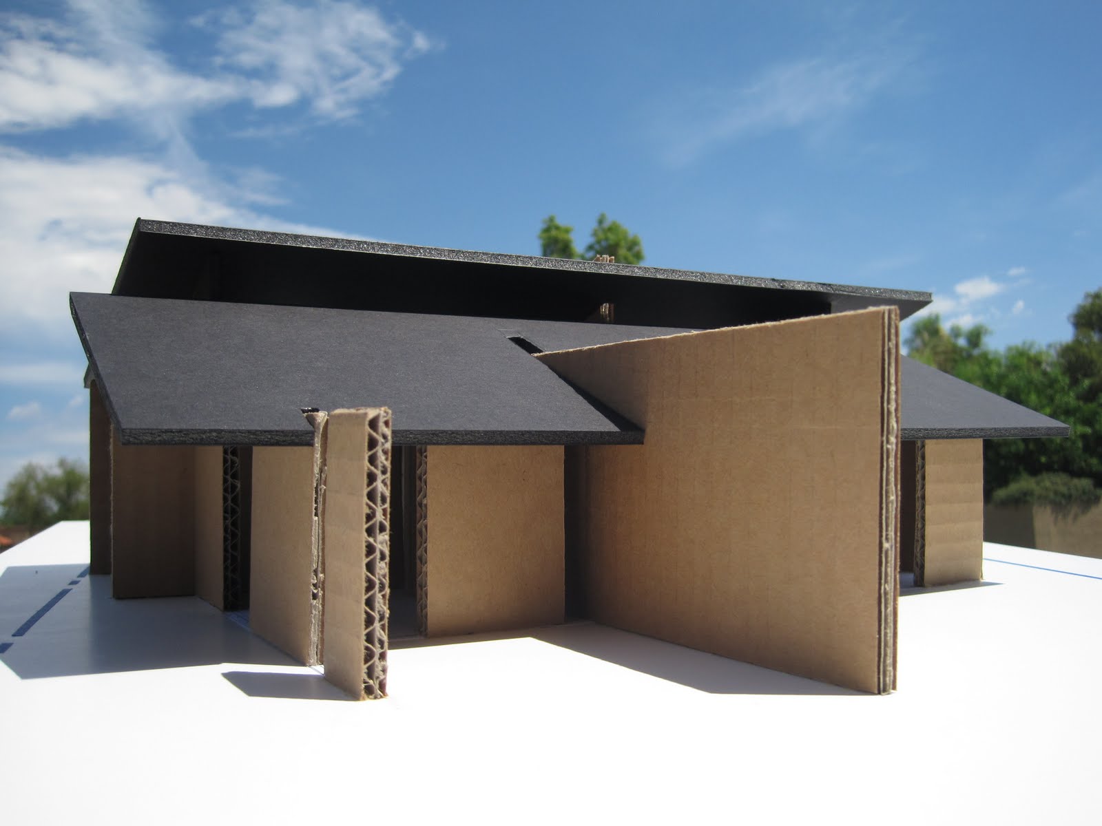
A new design/building idea has been simmering in my head for years, and I'm excited to finally present it, at least in model form. This idea is to free us from living in small boxes within bigger boxes, thus liberating us from running like mice inside labryinths we call "houses" or "office buildings".
We have essentially been designing/building boxes to live inside of since just after the caveman days. So, to demonstrate or represent this, I built a rather crude study model literally using a shoebox (photo 1). The metaphor is quite appropriate since I've actually heard the term used to describe many buildings. We move around all day from box to box (we call "rooms") looking for the cheese but never finding it. These "room" boxes are then all crammed inside bigger boxes (we call "buildings"), which are then crammed next to each other to form cities or "developments". We then "plunk" the shoebox anywhere on every last acre, not caring where because the box isn't site-specific (photos 2-4). Next, we "punch" holes in the box sides and doll them up with trim and decoration, wrapping the whole with ribbons (photo 5). Lastly, if it's a sloping roof we call it a "house", and if it's flat roof we call it a "commercial building". Signage has to be added to remind us which box we're in (photo 6).
The new idea is to break down the box (photo 7) and instead build screens that define space/function instead of confine it. This idea certainly has precedent with Frank Lloyd Wright's "destruction of the box" principle, as well as Mies Van Der Rohe's sliding planes of the Barcelona Pavilion. But I'm for pushing that envelope to an almost more literal interpretation. I'm for a more dynamic site engagement, unlike the indifferent generic box.
Imagine solid screens where necessary reaching out into the landscape and up to the sky , with glass "voids" in between to let space, light, views, and breezes flow entirely through the building (photos 8-?). Maybe some screens extend out from within to become planters, fountains or private terraces (photos ?-?). Even the roof "opens" up with clerestory windows for light, ventilation and views. This is an Organic Modernism (a term I invented that best describes it) freed from the creatively stifling shackles of fixed styles (Tuscany, Spanish Colonial, Santa Barbara, "Old World"??). This closer relationship with the environment will help us reconnect with and appreciate all the beauty of nature we are trying to protect. This new building can better "attach" itself to features/conditions specific to its site, leading to more "sustainable" or "green" solutions.
We've been detached from the landscape far too long, trying to conquer it instead of living integrally with it. It's time for a free architecture that better represents the spirit of Democracy for which this nation was born!


Idea for a New Skyscraper
I had to purge my brain of this skyscraper idea I've had for years! The idea is to honestly express the true nature of all skyscrapers, which is that they are all a series of stacked, horizontal floor plates. So, why not express the horizontal?! Most if not all skyscrapers try to accentuate the vertical. But, the building is already vertical by it's very height in relation to everything else around it. Maybe they're expressing the vertical circulation (elevators, stairs)?
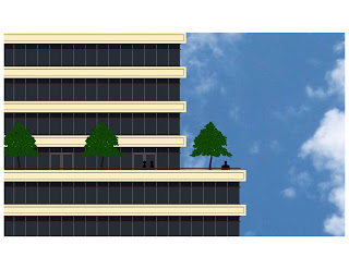
I like the idea and look of the floors expressed as "trays", with the glass line recessed, thus the floors creating shading (we do still need to solve the pigeon issue!). The building could be "planted" like a tree, operating with "green", sustainable ammenities and beautifying its site. And why are most skyscrapers the same drab colors (silver, gray, or just inane glass boxes)? Michael Graves' Portland Building is full of color and an amazing relief from the buildings around it (http://www.michaelgraves.com/). I imagine my building with very light cream color concrete floors and dark bronze-colored window mullions.
The Lobby level of this skyscraper could house a coffee/snack bar or other small retail shop. Maybe it could transform into a small art gallery or reception space for the public's use! The 1st floor above the Lobby could be a restaurant/cafe'/conference level open to the public, with access to a balcony provided with trees/planters, etc. as shown. Toward the top of the tower there could maybe be a penthouse level or more private conference areas with access to a balcony and more trees. At the top could be an observation deck (more shade trees) for the building's occupants and the public, with the service core expressively protruding out the top, capped by a communications tower! The building could be multi-functional for a variety of uses by many different people - office, conference, reception, tourism, dining, retail, gallery/exhibition, etc. This would help keep the occupancy rate high and increase it's popularity! Anyway, had to get it out there. If interested, please contact me. On to other ideas/projects/musing!


Idea for a New Skyscraper
I had to purge my brain of this skyscraper idea I've had for years! The idea is to honestly express the true nature of all skyscrapers, which is that they are all a series of stacked, horizontal floor plates. So, why not express the horizontal?! Most if not all skyscrapers try to accentuate the vertical. But, the building is already vertical by it's very height in relation to everything else around it. Maybe they're expressing the vertical circulation (elevators, stairs)?
I like the idea and look of the floors expressed as "trays", with the glass line recessed, thus the floors creating shading (we do still need to solve the pigeon issue!). The building could be "planted" like a tree, operating with "green", sustainable ammenities and beautifying its site. And why are most skyscrapers the same drab colors (silver, gray, or just inane glass boxes)? Michael Graves' Portland Building is full of color and an amazing relief from the buildings around it (http://www.michaelgraves.com/). I imagine my building with very light cream color concrete floors and dark bronze-colored window mullions.
The Lobby level of this skyscraper could house a coffee/snack bar or other small retail shop. Maybe it could transform into a small art gallery or reception space for the public's use! The 1st floor above the Lobby could be a restaurant/cafe'/conference level open to the public, with access to a balcony provided with trees/planters, etc. as shown. Toward the top of the tower there could maybe be a penthouse level or more private conference areas with access to a balcony and more trees. At the top could be an observation deck (more shade trees) for the building's occupants and the public, with the service core expressively protruding out the top, capped by a communications tower! The building could be multi-functional for a variety of uses by many different people - office, conference, reception, tourism, dining, retail, gallery/exhibition, etc. This would help keep the occupancy rate high and increase it's popularity! Anyway, had to get it out there. If interested, please contact me. On to other ideas/projects/musing!


Comfortable Office Increases Morale
After photographing this recently-completed office and talking with the Client (Phoenix Foot & Ankle Associates, PC), it came to be realized that the design has been good for the staff (they LOVE their new space) as well as the patients (they are more relaxed). This was achieved due to a close working relationship with the Client in terms of understanding the program, budget, image, project goals and requirements.
Color, texture, pattern and a variety of different lighting types helped create visual interest and a comfortable ambience that isn't usually found in most medical offices. In working with Leighann Jacobi of Jacobi Interiors, the "clinical" feel most medical offices have was completely done away with. Instead, it feels more like a home, which I know is a very cliche' comment, but the doctor agreed that this feeling was better for patients and staff. I think more medical outpatient facilities would benefit from this kind of design approach. As you can see in the photos below, we employed the following design strategies to create a truly unique space:
1. Variety of color, pattern, texture and lighting.
2. A planter and water wall in the Waiting Room bring in nature and create a soothing spa-like space.
3. Glass walls at the hallway offices bring in natural light.
4. Stretched fabric ceiling "clouds" soften the otherwise exposed roof structure.
Because of all the medical and dental office work we do, we are inspired by the trust the Client had in us to think outside the typical medical box and design a space that's win-win for both patient and doctor. We look forward to spreading much more of this design philosophy across the industry.


