Dental Office

Dental Office

Wednesday, August 31, 2011

Cost-Saving Design Tips for Your New Home or Remodel

The economy from 2007 to now (2011) and probably beyond has caused/will cause us all to more thoroughly analyze our expenses and what we're getting for them. Especially hard-hit has obviously been the residential market. The combination of sub-prime mortgages and unrealistic lending practices, along with the McMansion craze and HUGELY over-inflated values could lead to nothing else but a meltdown. The good that might be coming out of this is that people are appreciating that life is not about how big and how much $$, but rather what is the overall quality for the buck. In other words, a lot of us are going "back to basics".

In terms of designing and building your new house or remodeling your existing, "back to basics" can actually be a prudent and exciting design strategy. The size of the average home is actually decreasing by 10-20%. This is a positive trend in my opinion because it becomes more affordable, more livable and easier to maintain for clients, and easier on the environment. Clients want more involvement in the reasoning and logic behind design decisions and how the associated costs enhance the quality of their lives. They, along with their architect, can then make informed decisions in relation to their budget.

That being said, and after much research, experience, and just plain thinking, I've come up with many design tips (up to about 60 now!) to help you manage your home design/construction budget. Here are 10 of those tips:

1.   Size: Focus on what you absolutely need 1st, then, if budget allows, go to those "wouldn't that be cool" extras. Remember, everybody talks in terms of cost/square foot, so less square feet can help control cost.
2.   Materials: 20' ceilings add a lot of extra material cost as well as associated labor.
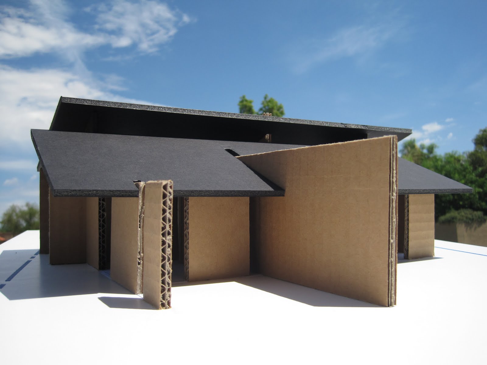
3.  Shape: I've seen SO MANY new home plans with 48 corners, angles, curves, turrets, etc. A complicated floor plan means a complicated, more expensive facade and roof. Simplify.
4.   Plumbing: Group/combine/stack plumbing to save on piping lengths.
5.   Lot: Flat lots are typically less expensive to build on than sloping or "rocky" lots.
6.  Cabinetry: Cabinets are usually expensive items, so be careful to use wisely. IKEA may be a good option, too. Cherry or Mahogany built-ins everywhere are going to be costly.
7.  A/C-Heat: Passive solar design can help reduce the amount of heating and A/C you might need. Orient the house taking advantage of breezes, shade and block cold winter winds.
8.  Lighting: Built-in, specialty lighting can get expensive, especially if they are from overseas. Use table/floor lamps with bulbs that you can get anywhere. Again, orient the home & use windows to take advantage of natural light.
9.  Landscaping: Maybe plant younger, smaller trees/shrubs, use xeriscaping & reduce irrigation needed. Maybe use pavers instead of concrete.
10. Walls/Doors: Try to reduce the number of walls/doors that compartmentalize the space. Open it up! Define space/needs instead of confining them.

I hope this helps. I'm always interested in designing appropriately-sized, high quality custom houses that don't break the bank. Please feel free to contact me at http://www.colinslais.com/ for your new home. I have 50 more ways to save cost and help you realize your dream!

Tuesday, August 23, 2011

Updating Frank Lloyd Wright

Frank Lloyd Wright has been my inspiration for many years. Having visited nearly 200 of his buildings (even renting a few) along with extensive reading & conversations w/ homeowners, I consider myself somewhat of a Wright expert. His Usonian homes w/ their simple, clean lines, expressed floor grid, overall orderliness, and of course, connection to nature excite me the most.

Wright taught that an architect should develop his/her own individual nature from within. We should learn & grow from looking INTO, not AT. So, as an architect w/ an inquisitive mind and "countenance of principle", I intend to blaze my own trail of a new Organic architecture for the 21st century. With this said, there are some "shortcomings" I've personally experienced (at 6'-2" tall) and been informed of by homeowners that we can address & update for the future. Let's briefly review these and strategize more acceptable alternatives to quell some criticism of Wright's work:

1.) Leaks (Walls/Roofs) - Wright's Usonian homes gave the blessings of architecture at extremely low cost ($5K at one point). We can now properly flash, seal & provide better water-resistive barriers w/ new products complying w/ code.
2.) Sagging Cantilevers (Roofs) - Materials/Technologies weren't ready for Wright's inventiveness like they are now. Stronger, lighter engineered woods & proper use of steel will mitigate this issue. Again, for Wright, cost imposed many material limitations.
3.) Heating/Cooling - When Wright's underfloor radiant heating worked, it was wonderful, but an expensive headache when it didn't. Many Usonians didn't have A/C when originally built (save cost & rely on shading, natural breezes). Homes today typically need both, & the design should accommodate (see #9 Insulation). However, passive solar design should still be used to reduce utility cost & lower carbon footprint.
4.) Low Ceilings - Wright definitely owns the idea of horizontality & human scale. But, we know we've gotten bigger (and taller?). Current code now sets minimum ceiling height anyway (which are still comfortable for me at 6'-2" tall). Any ceiling above 8' (drywall/plywood standard size) except in large rooms is a waste of material/$. Breadth of space can do more than height.
5.) Dark Rooms - I thought the bedrooms in the Tracy Residence (Washington State) were dark due to small clerestory windows (lots of shade outside) & dark wood wall paneling. The wood paneling in the Usonians tended to be darker than walls that can be painted, say, a light color. Lighter colors reflect light & make space feel bigger/more open.
6.) Small Bedrooms/Kitchens/Doorways/Hallways - Wright was saving cost & maintaining human scale. However, today human scale needs adjusting. Also, we now live more in our Kitchens & Bedrooms than maybe we did in the 50's. Sizes need to increase, but not any bigger than necessary to function.
7.) Monotony (Too Much Wood, No Variety in Color) - Wright's Usonian houses were thoroughbreds reduced to a minimum of materials for cost, but also for design continuity & a sense of repose. My wife's comment on the Palmer House http://www.vrbo.com/246204 (which we loved) was that there was a lot of same-colored wood walls/ceilings throughout. I can appreciate the observation, but also the sense of continuity. Nice thing about paint is variety & the ability to change.


8.) Architect Control, Inflexibility, Built-Ins - Wright undoubtedly controlled the built environment through design. When you hired him, you knew what you were getting. To that end, he tried to minimize "poor taste" by building in tables, seats, shelves, etc. Though this provides continuity again, it's inflexible for today's ever-changing needs. I believe in designing or purchasing things that look a part of the whole, but be movable and transportable when moving to a new city, thus allowing more freedom.
9.) Poor Insulation, Single-Pane Glass - Again, saving cost, Wright had to minimize material quantity. He didn't use studs for walls, thus decreasing insulation space. Roofs were minimally insulated as well, and double-pane glass not available yet. Today, especially w/ new "green" building techniques, double-pane Low-E insulated glass is becoming typical, along w/ foam insulation & exterior polystyrene board. Much better R-values (insulation values) are attainable.
10.) Enclosed Kitchens - Wright invented the open plan common today. Ironically, his Kitchens (he named "Workspaces") were still closed off from the Living area. We've already done a good job of opening up the Kitchen these days to become an attractive, integral, and even desired part of the Living space. The barstool island (becoming way overdone) is the only separation now. I think Mr. Wright would approve of this development, but who knows.


Wednesday, August 3, 2011

The Architect and Public Perception

Having been an architect for quite some time, I continue to get the same questions from people, namely, "Do you do residential or commercial?" and "What type of style do you do?", or here in Arizona, "Do you do Santa Barbara, Tuscany, Spanish Colonial, _________?" It occurred to me that the public's perception of an architect is that he/she does whatever the client wants.

While it's true the architect must design to meet client needs while also considering site conditions, building codes, etc., what the public does not perceive is the architect as, in some part, an artist. Why? We architects might not be doing well enough in educating the public on not only what an architect does, but who an architect is. Though it seems most architects will do just about whatever the client says, thus perpetuating the perception, there are some who live and work by their own principles or beliefs. They have a distinct "signature" or direction from which they won't stray too far because they believe strongly in the benefits to the quality of the work and to life itself.

In other words, clients might unknowingly be telling a "Picasso" to paint them a "Renoir". I think we all know that no artist of merit would paint like another. So, how can we inform the public that architects can still be artists with very different approaches? It's up to the profession itself through more public speaking, more community engagement, more writing, more school involvement, etc. And just maybe, architects could show more of their own work and ideas in public exhibits and finally taste some of that wine and cheese.

Sunday, July 31, 2011

Skyscraper Idea

I had to purge my brain of this skyscraper idea I've had for years! The idea is to honestly express the true nature of all skyscrapers, which is that they are all a series of stacked, horizontal floor plates. So, why not express the horizontal?! Most if not all skyscrapers try to accentuate the vertical. But, the building is already vertical by it's very height in relation to everything else around it. Maybe they're expressing the vertical circulation (elevators, stairs)?

 I like the idea and look of the floors expressed as "trays", with the glass line recessed, thus the floors creating shading (we do still need to solve the pigeon issue!). The building could be "planted" like a tree, operating with "green", sustainable ammenities and beautifying its site. And why are most skyscrapers the same drab colors (silver, gray, or just inane glass boxes)? Michael Graves' Portland Building is full of color and an amazing relief from the buildings around it (http://www.michaelgraves.com/). I imagine my building with very light cream color concrete floors and dark bronze-colored window mullions.

The Lobby level of this skyscraper could house a coffee/snack bar or other small retail shop. Maybe it could transform into a small art gallery or reception space for the public's use! The 1st floor above the Lobby could be a restaurant/cafe'/conference level open to the public, with access to a balcony provided with trees/planters, etc. as shown. Toward the top of the tower there could maybe be a penthouse level or more private conference areas with access to a balcony and more trees. At the top could be an observation deck (more shade trees) for the building's occupants and the public, with the service core expressively protruding out the top, capped by a communications tower! The building could be multi-functional for a variety of uses by many different people - office, conference, reception, tourism, dining, retail, gallery/exhibition, etc. This would help keep the occupancy rate high and increase it's popularity! Anyway, had to get it out there. If interested, please contact me. On to other ideas/projects/musing!


Saturday, July 30, 2011

Beyond the Box - Time for a New Architecture

A new design/building idea has been simmering in my head for years, and I'm excited to finally present it, at least in model form. This idea is to free us from living in small boxes within bigger boxes, thus liberating us from running like mice inside labryinths we call "houses" or "office buildings".

We have essentially been designing/building boxes to live inside of since just after the caveman days. So, to demonstrate or represent this, I built a rather crude study model literally using a shoebox (photo 1). The metaphor is quite appropriate since I've actually heard the term used to describe many buildings. We move around all day from box to box (we call "rooms") looking for the cheese but never finding it. These "room" boxes are then all crammed inside bigger boxes (we call "buildings"), which are then crammed next to each other to form cities or "developments". We then "plunk" the shoebox anywhere on every last acre, not caring where because the box isn't site-specific (photos 2-4). Next, we "punch" holes in the box sides and doll them up with trim and decoration, wrapping the whole with ribbons (photo 5). Lastly, if it's a sloping roof we call it a "house", and if it's flat roof we call it a "commercial building". Signage has to be added to remind us which box we're in (photo 6).

The new idea is to break down the box (photo 7) and instead build screens that define space/function instead of confine it. This idea certainly has precedent with Frank Lloyd Wright's "destruction of the box" principle, as well as Mies Van Der Rohe's sliding planes of the Barcelona Pavilion. But I'm for pushing that envelope to an almost more literal interpretation. I'm for a more dynamic site engagement, unlike the indifferent generic box.

Imagine solid screens where necessary reaching out into the landscape and up to the sky , with glass "voids" in between to let space, light, views, and breezes flow entirely through the building (photos 8-?). Maybe some screens extend out from within to become planters, fountains or private terraces (photos ?-?). Even the roof "opens" up with clerestory windows for light, ventilation and views. This is an Organic Modernism (a term I invented that best describes it) freed from the creatively stifling shackles of fixed styles (Tuscany, Spanish Colonial, Santa Barbara, "Old World"??). This closer relationship with the environment will help us reconnect with and appreciate all the beauty of nature we are trying to protect. This new building can better "attach" itself to features/conditions specific to its site, leading to more "sustainable" or "green" solutions.

We've been detached from the landscape far too long, trying to conquer it instead of living integrally with it. It's time for a free architecture that better represents the spirit of Democracy for which this nation was born!


Tuesday, May 31, 2011

Frank Lloyd Wright's David Wright House

I and members of the Contemporary Forum, an art-aficionado group, had the distinct pleasure of touring Frank Lloyd Wright's David Wright House in Phoenix, Arizona. David Wright was FLlW's son from the first marriage, and both he and his wife, Gladys, lived very long lives. David was in the concrete block business, so the house is, of course, concrete block. However, it's odd that the house was first conceived in wood -- probably because of it's unique circular shape.

The house spirals up a wide ramp to the main floor which "floats" above the hot desert floor and allows breezes to flow underneath. There is a small pool by the ramp with a central garden that the house surrounds. All of the walls are block inside and out with Mr. Wright's trademark red concrete floors. The wood cabinetry is built in, of course, and the wood board ceilings are some of the most intricate and beautiful I've seen. The finish carpentry in this house is incredible!

The house has been shrouded in mystery for years, and as I have understsood, no strangers had been allowed to see it for decades. I remember visiting in 1995 with a friend of mine. We stood at the driveway by the mailbox that simply read "Wright". There were tarps over the windows facing the street. It was very eerie.

Unfortunately, David and Gladys passed on in the house, and last I knew, it was for sale. It was an honor to be able to walk through it's graceful, flowing space -- to imagine living in it day by day, enjoying both fireplaces on cold desert evenings. Once again, Wright was able to build an idea, based on the organic principles he maintained all his life. It's not merely another house, but instead a free, creative, thoughtful response to Client, site, and human imagination in the hands of a master! Enjoy the photos below.


Monday, April 4, 2011

Frank Lloyd Wright's Penfield House

We had the thrilling pleasure of staying a few days at Frank Lloyd Wright's Penfield House in Willoughby Hills, Ohio (visit http://www.penfieldhouse.com/ to book reservations!). It was early November and the crisp autumn air happily required a glowing fire in the large centrally-located fireplace. The house is on acres of land with trees and clearings for walks and views of the Chagrin River. Nature sets the stage as you (the audience) watch through floor-to-ceiling windows/doors from the comfort of the built-in Living Room bench. You are surrounded by various fall colors visible through the many windows in every room. The view of trees from the 2nd story bedroom invokes a treehouse feel -- that you're a part of the landscape, not separate from it. You "float" up to the 2nd floor by wood stair treads with open risers so as not to obstruct views (see photos below).

Louis Penfield was 6'-8" and so the house has taller ceilings and is more vertical than the infamous low-ceilinged horizontality of Wright's other work. When asked if he could design a house for someone so tall, Wright replied, "Yes, but we'll have to design a machine to tip you sideways first." The wood post supports harmonize with the verticality of the multiple tree trunks around the house. This consistent structural system is clearly expressed throughout the house, with solid or glass infill panels as screens defining space.

Overall the house is a pure joy to experience. It's like nothing else, and you never want to leave its serenity and beauty. It allows you to slow down and relax into your natural, biological rhythm. I encourage everyone to visit, but beware, you'll miss it, and you will never look at your current home the same way.

See my February 11, 2011 blog on "Frank Lloyd Wright's Palmer House" for another truly unique experience!


Monday, March 28, 2011

The Environment -- Essential Beauty

March 27th , 2011 was such a perfectly beautiful day that I had to take the photo below from our front courtyard bench. Imagine birds singing with our nearby wind chime keeping tune. A gently-caressing, cool breeze passes over as you quietly read and sip a delicious glass of juice.

This was one of those perfect-weather days that we all cherrish! So perfect, in fact, that it inspires you and elevates your spirit as much as any religion can. It also got me thinking about just how essential a clean, safe, healthy environment is for the sustenance of ALL LIFE!

Exxon Valdez, Chernobyl, Times Beach, The Gulf Oil Spill, Fukushima Power Plant, pollution, garbage "islands" floating in the world's seas, overfishing, the voracious demand for energy, food and water......HUMANS, not anything else, but HUMANS are literally destroying planet Earth. This is not an opinion, it's a fact. So, we have to ask ourselves, if we maintain status quo, how in the world can this tiny planet with LIMITED RESOURCES possibly continue to support this unconscionable behavior along with population growth that will only require MORE food, MORE water, MORE energy???

For the survival of ALL species, we MUST, MUST conserve energy and resources while implementing alternative energy sources. We must stop SUPER-SIZING everything -- waste less food, water and natural resources. We MUST recycle more and throw less in landfills.

If we don't change our destructive behavior RIGHT NOW, there won't be many days like this left. ALL life DESERVES a clean, safe, healthy environment in which to live peacefully. ALL life around the world deserves to enjoy many perfectly beautiful days!

Friday, March 25, 2011

The Invisible Roof

There have been many movements, or styles, in architecture throughout history, from Classical and Baroque to the Prairie Style, Modernism and Deconstructivism, etc. Today’s new buildings continue this evolution in the perpetual search of expressing our time. The one constant through all this change that will always be the basic purpose of architecture is shelter! Shelter has, throughout time, been especially concerned with the overhead, expressed by visible roofs with names like gable, hip, shed and dome, etc. Because these roofs were visible, a variety of materials and colors were used to celebrate this function of shelter.

However, with the Industrial Revolution and the turn of the century, the visible roof began to disappear and give way to the “flat” plane (which still, by the way, has some slope). This “flat” roof plane sometimes still had an eave, but with the International Style and “machine-age” becoming more popular, the visible roof vanished and metamorphosized into parapets and flatter, abstract forms & surfaces. This challenged the notion of what shelter could be while breaking free from traditional forms, which coincides with what was happening in the art world regarding challenging traditional subject matter in favor of a new expression of a brave new world (which I think is utterly essential!). But, this all has raised a question within me – what has “removing” the roof done to much of the architecture today??

Many of today’s more publicized buildings appear to me as “machines”, devoid of the sense of human scale and shelter that generous roofs can help provide. Roofs protect us from the elements (which tend to come from above) as well as protect the exterior building “skin”, which can help reduce maintenance. With flatter surfaces and more box-like forms, today’s buildings do not invoke the same feeling of comfort that can come from a good “hat” to keep the sun and rain off.

Most of the “cutting-edge” structures in the magazines today also seem to depend heavily on new technology for everything from heating & air conditioning requirements (which a good roof with appropriate overhangs could minimize), to electrical and security systems, as well as for the exterior materials. Again, while I encourage R&D for a better future, there is a tendency for the mere celebratory expression of technical prowess, resulting in buildings appearing thin, fragile, temporary objects, separate from nature and the very people for which they were designed.

So, what about the roof? I think it’s important we don’t lose sight of what a good roof represents in architecture for our fellow human family – shelter, protection and comfort. Nature’s elements should and will always play the leading role in how we build in harmonious connection with them (especially with today’s climate issues), regardless of how “advanced” technology may seduce us into a false sense of detachment from an ever-changing environment. What do you think?.....

Thursday, March 24, 2011

Is Artificiality OK?

I recently returned from a presentation by a countertop manufacturer for continuing education credit. He discussed how solid surfaces can now look like marble or granite for much cheaper prices. He spoke about benefits of seamless transitions, easier repairs and installation, etc. Someone even asked if this solid surface material could be made to resemble wood. He said the technology was coming.

This got me thinking.......is artificiality OK in architecture or our world in general for that matter? We now have artificial turf and plants, vinyl siding resembling wood clapboard, concrete roof tiles resembling wood shake, vinyl flooring resembling wood plank, plastic laminates resembling about any material you want, etc., etc. We have new buildings that look old and older people that look younger. Brunettes are blond and grey hair is never to be seen. By the way, most of what we eat and drink is artificial. It raises the question if this should be acceptable? Doesn't it just FEEL like somehow or other this is going to come back and bite us?

Of course there are pros and cons to everything. The artificial products briefly mentioned above do have some big positives -- lower financial cost and maintenance, less depletion of certain resources, greater durability and lifespan, etc. But what will be the catch? There is ALWAYS a catch! Could we be poisoning our bodies and increasing certain disease risks with artificial foods or from product off-gassing? Are we building a world where PERCEPTION of truth is replacing truth? What would be wrong with a world where very little is as it seems? It feels like a philisophical question -- one that I've not heard posed, until now. I haven't formulated my own definitive opinion yet, other than it just FEELS like we are headed in a dangerous direction.

Wednesday, March 23, 2011

The Importance of Planning

"The good life is planned like a good game of golf -- never perfect but able to recover" is a quote of mine that I live by daily. Whether it's space planning, financial planning, vacation or retirement, all of us need to plan for the future. Planning means preparing for what we WANT to happen, or what we think we can control. However, just as important, it means preparing for the unpredictable, or what we don't think we can control. It's comparable to insurance, I suppose. I've heard many people say that life is too unpredictable to plan, that "things just happen". This implies a philosophy that we are all on some roller coaster ride we didn't choose and that we are at the mercy of only one set of tracks as a mere passenger -- such is our lot in life!
 
However, if we CHOOSE to THINK differently, to change our perspective from passenger to driver, then PLANNING becomes a powerful tool for not only accomplishing goals, but VISUALIZING constructive options and opportunities for a better life -- our own set of tracks! Life may have some unpredictability, but planning is still the key to achieving goals and being better prepared for the unexpected. I've read that Arnold Schwarzenegger has had a "Master Plan' for his whole life and that he has achieved almost everything on it thus far.

So, despite some detours en route, keep moving forward according to plan. Just as with Master Planning large developments, we need to "see" the big picture, the end goal so that we can initiate the first smaller steps toward ultimate accomplishment!

Monday, March 21, 2011

Comfortable Office Increases Morale

After photographing this recently-completed office and talking with the Client (Phoenix Foot & Ankle Associates, PC), it came to be realized that the design has been good for the staff (they LOVE their new space) as well as the patients (they are more relaxed). This was achieved due to a close working relationship with the Client in terms of understanding the program, budget, image, project goals and requirements.

Color, texture, pattern and a variety of different lighting types helped create visual interest and a comfortable ambience that isn't usually found in most medical offices. In working with Leighann Jacobi of Jacobi Interiors, the "clinical" feel most medical offices have was completely done away with. Instead, it feels more like a home, which I know is a very cliche' comment, but the doctor agreed that this feeling was better for patients and staff. I think more medical outpatient facilities would benefit from this kind of design approach. As you can see in the photos below, we employed the following design strategies to create a truly unique space:

1.   Variety of color, pattern, texture and lighting.
2.   A planter and water wall in the Waiting Room bring in nature and create a soothing spa-like space.
3.   Glass walls at the hallway offices bring in natural light.
4.   Stretched fabric ceiling "clouds" soften the otherwise exposed roof structure.

Because of all the medical and dental office work we do, we are inspired by the trust the Client had in us to think outside the typical medical box and design a space that's win-win for both patient and doctor. We look forward to spreading much more of this design philosophy across the industry.


Friday, February 11, 2011

Frank Lloyd Wright's Palmer House

As an admiring Frank Lloyd Wright fan, you might imagine how thrilled we were at staying 2 nights in the infamous Palmer House in Ann Arbor, Michigan. Yes, you can rent the house all to yourself! Just visit http://www.vrbo.com/246204 for reservations. The home is a spectacular composition of warm, red concrete floors, glass, wood & brick on a triangular module -- all seemlessly wedded to its lush site. "Of the hill, not on it" Mr. Wright exclaimed. Both site and house are enhanced by each other as a harmonious whole.

We loved the warm, golden early morning sun waking up the home. It's a peaceful, spiritual respite to renew your soul. It's also cozy and protective yet intimately connected to the ever-changing out-of-doors. The generous eaves shelter you snugly from the pattering of rain on the roof. What masterful harmony of respecting nature while elevating everyday human needs to a more profound level.

Wright reminds us that we are part of nature, not separate from it. This house allows your natural biological rhythms to re-calibrate. It encourages you to slow down enough to experience the numerous variety of plants and animals (even some occasional deer!). Leaving is always tough because you want to live like that the rest of yor life. It's definitely life-changing and worth the trip! I would love to design a house with this kind of integrity for a willing Client. The photos say everything! Enjoy them and hopefully you will experience the tranquility first-hand one day soon!


Note: All photography by Colin Edward Slais with permission of Owner for this blog only. Copies are strictly prohibited without express written consent of the Homeowner.